
TDK Ventures
Basic Elements
TDK Ventures inherits three primary colors from the TDK Corporate brand guide. These are TDK Blue, black, and white. However, TDK Blue should always be the priority whenever possible.
Secondary colors can be used for external communication, in conjunction with the primary palette.
An example use case might be to highlight a Call To Action.
The colors should support the message you want to convey without detracting from the primary palette.
All digital assets should only utilize the HEX color code.
All printed materials should utilize the CMYK color code.
*Pantone colors may only be used on printed assets when CMYK is not an available option.
Primary Palette
Primary Palette
Colors
TDK Ventures inherits three primary colors from the TDK Corporate brand guide. These are TDK Blue, black, and white. However, TDK Blue should always be the priority whenever possible.
Secondary colors can be used for external communication, in conjunction with the primary palette.
An example use case might be to highlight a Call To Action.
The colors should support the message you want to convey without detracting from the primary palette.
All digital assets should only utilize the HEX color code.
All printed materials should utilize the CMYK color code.
*Pantone colors may only be used on printed assets when CMYK is not an available option.
Primary Palette
Primary Palette
Color Gradation TDK Blue
For specific applications, TDK Corporate has extended the color palette by a defined color graduation of TDK Blue. This can be used as additional colors if necessary. No graduations of other colors are permitted.
Color Gradiation

Color Gradation Brand Mark Usage
This chart tests for the successful reproduction of the TDK mark and TDK Ventures logo against a background color rising in 10% increments of concentration. It also helps determine which of the primary palette colors should be used against which graduated primary palette background colors.
With a Background Color of the TDK Blue

With a Dark Background Color

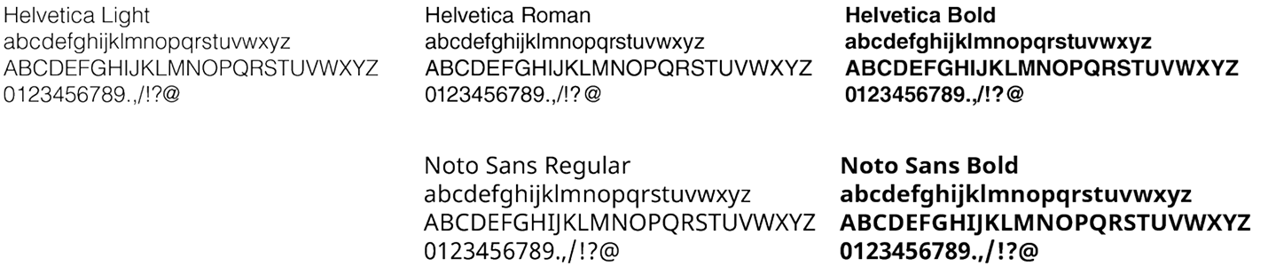
Typography
TDK Ventures inherits its fonts from the TDK Corporate brand guide.
Helvetica should be used for all print publications, videos, animations and online media that is not dynamically generated by CSS or other programming language.
Noto Sans should be used in place of Helvetica on all websites, applications or other online media where the font is dynamically generated by CSS or other programming language. This is due to numerous technical and license concerns.
Arial is the approved font for use throughout the Microsoft ecosystem.
Online media
Website
Microsoft Office
Font Color
With respect to how fonts are used over a colored background:
- TDK Blue or black fonts should be used on white backgrounds.
- Only white should be used on a TDK Blue background.
- Only black and/or white should be used on secondary color backgrounds.
Primary Palette
Secondary Palette
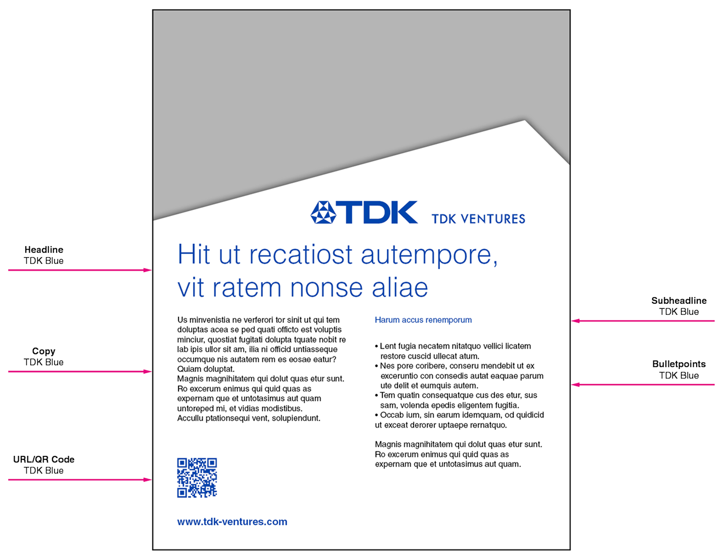
Font Usage
Font size and text amount heavily influence readability, which should always be the primary driver. Therefore, foster readability however necessary even if that requires a deviation from this section without compromising other guidelines.
Colors
Headlines should be White on a TDK Blue background, or black or TDK Blue on a white background. The copy text should always be black. A web link may be colored in TDK Blue to make it stand out.
Capitalization Rules
For titles, headlines and sub-lines, only the first letter should be capitalized.
Text Alignment
Text should always be left-aligned with a ragged right margin.
In-line gaps and unsightly jagged line endings should be avoided .
Whenever possible, avoid hyphenating words, especially proper nouns.
Copy – First Words
Use bold letters to highlight a word or paragraph.
Bullet Points
Use single dots as bullet points in the correct color (see also print media).
Example Layout
Logo
The TDK Corporate mark and TDK Ventures text combine to create the “TDK Ventures’ logo.” It is the symbol that represents the TDK Ventures brand and stands for the TDK Ventures’ corporate responsibility while providing assurance of the quality of its services.
Horizontal Logomark

Stacked Logomark

TDK Ventures Mark
The TDK Corporate mark and TDK Ventures text combine to create the “TDK Ventures’ logo.” It is the symbol that represents the TDK Ventures brand and stands for the TDK Ventures’ corporate responsibility while providing assurance of the quality of its services.
Horizontal Logomark
Stacked Logomark
TDK Diamond
The TDK diamond must only be used in the defined combination with the TDK Ventures text (logo). It must not be used standalone as a symbol or icon, except under the following conditions:
- The use as favicon in the web browser.
- Speaker icon on the event website in pre-approved cases.
Limited Use Examples of the TDK Diamond
Logomark Measurements
The TDK Ventures’ logo must always be used in the defined combination and measurement.
Logo and communication message must be surrounded by a sufficient amount of blank space. This is called the “minimum distance”. The minimum distance is the permissible distance between TDK Ventures logo and communication message, and other elements such as typography, illustrations, pictures, etc.
The TDK Ventures logo must not be smaller than 1.2 inches (30mm).
Measurements

Minimum distance

Minimum Size

Logomark Colors
On every piece of communication the TDK Ventures’ logo must be presented consistently and in the correct colors.
TDK Blue is the preferred version and must be placed on a white background. Alternatively in white on a TDK Blue background. In rarer cases it can be used in black, or white on a black or dark image background.
Colors and Background
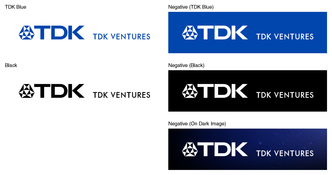
Correct Usage
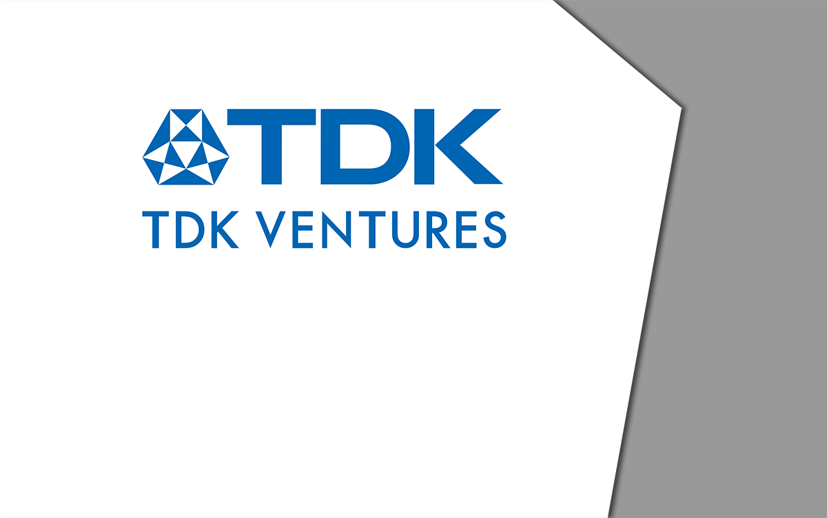
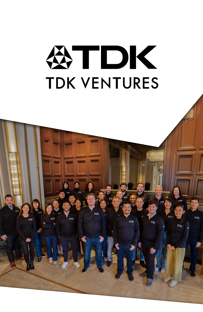
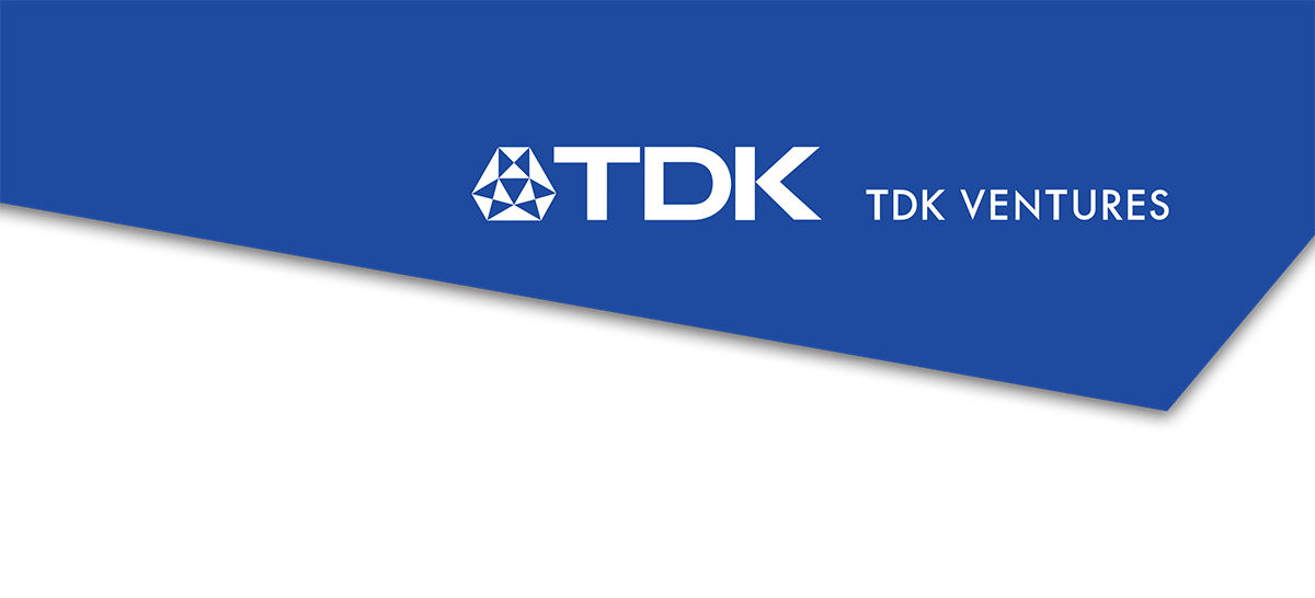
To honor TDK and gain connected recognition to their reputation, they prefer the TDK Ventures’ logo be consistently and uniformly displayed in TDK’s “Shape” whenever possible and on the correct background.
Correct Usage Examples
Incorrect Usage
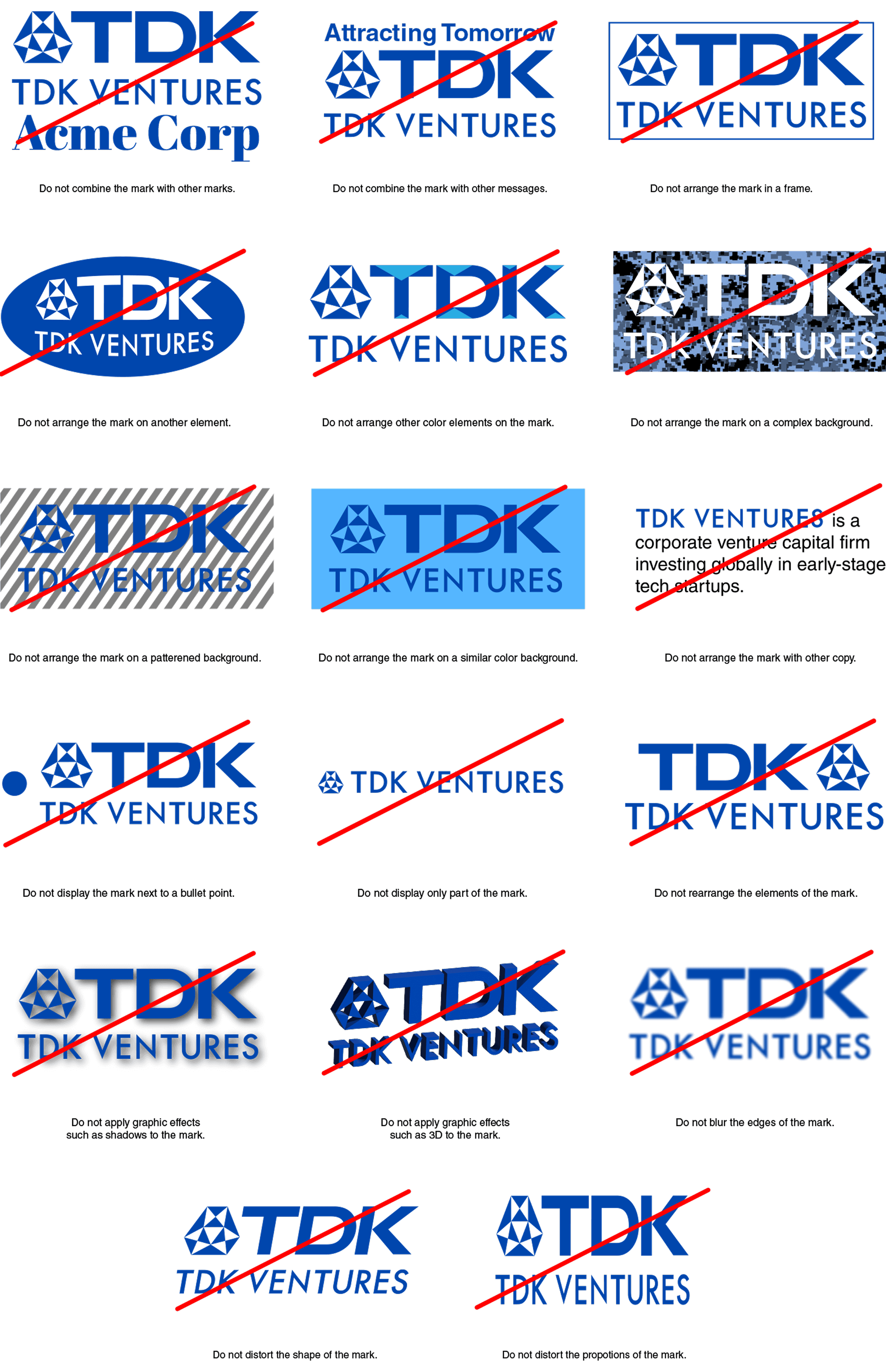
The TDK Ventures’ logo should never be altered by adding, subtracting, or modifying content in any way.
Do not extract excerpts for separate use or use or create other logos to represent organizational units, projects, or single products. This is only permitted in a few special exceptions.
Incorrect Usage Examples
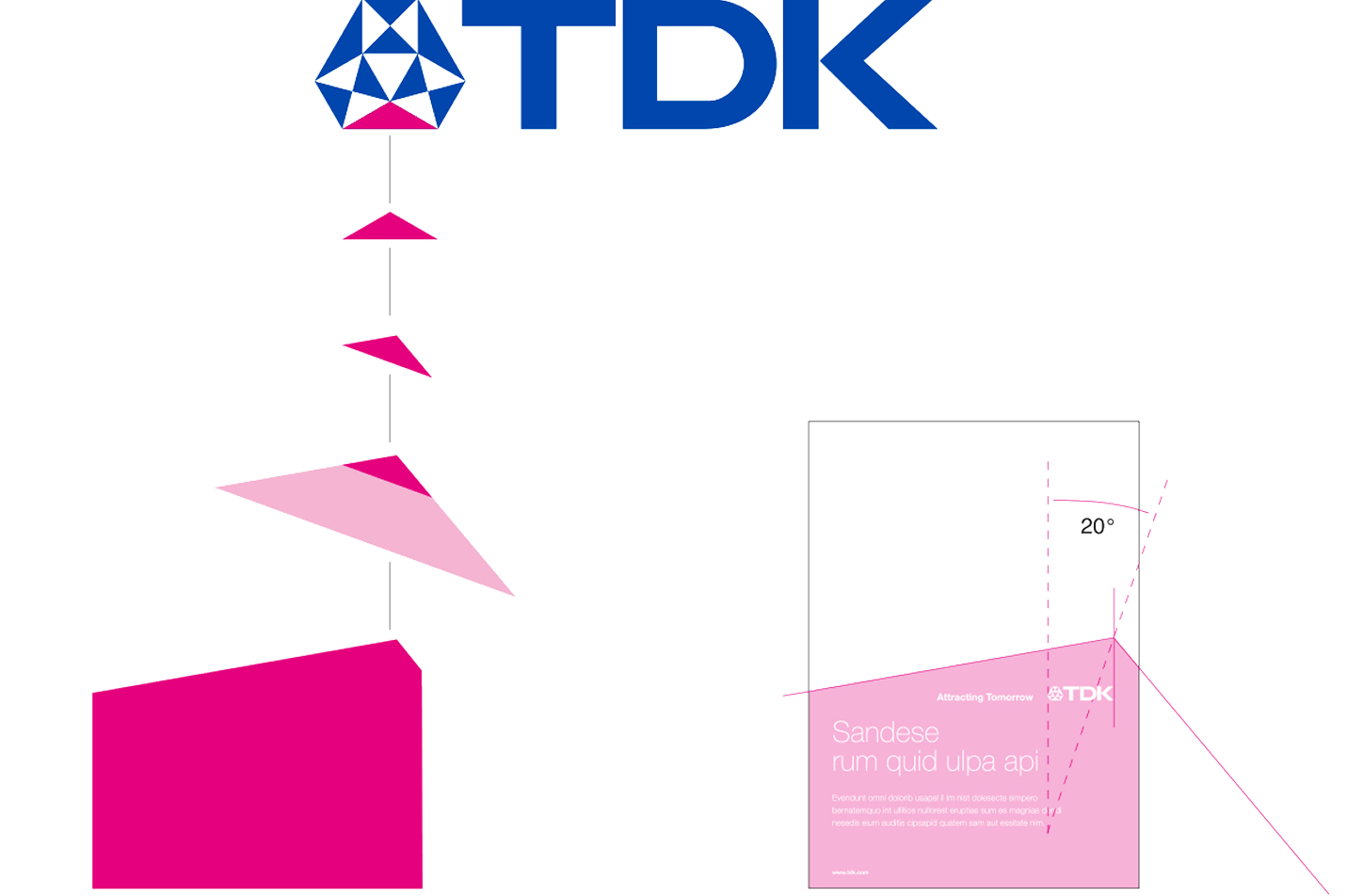
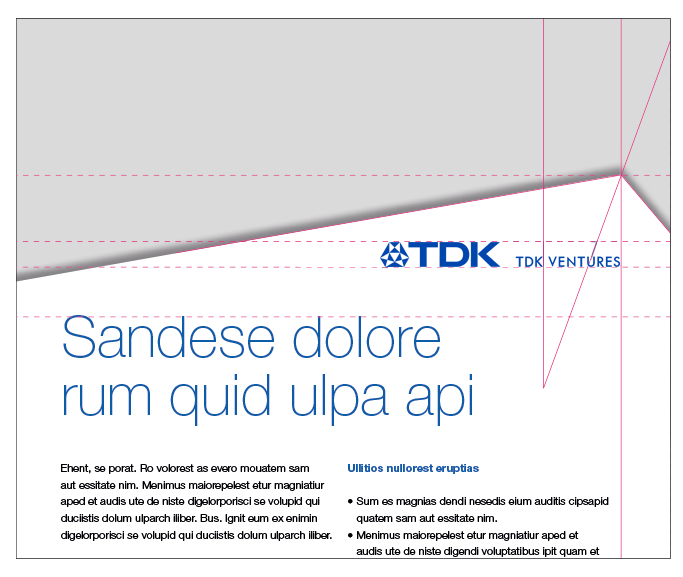
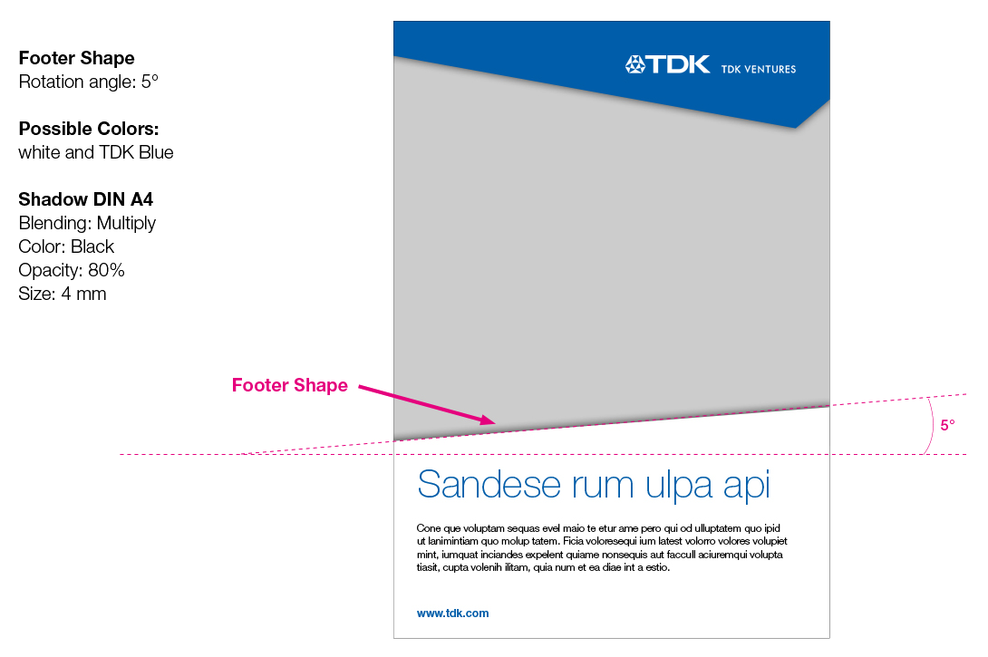
The Shape
A single part of the TDK diamond becomes the key design element and basis of the TDK look and feel. It is called “the shape”.
Derived as a part of the TDK diamond, it is the layout of the TDK design concept.
The high flexibility of the shape as a design element is essential:
- Size could vary from minimum to maximum space
- Position could be from bottom or top, as well as left or right
- Colors could be white, TDK Blue or even transparent
- Combination with the footer shape for even more flexibility
This flexible layout structure enables content to be conveyed clearly and precisely. From small to big shape, the division of the layout is geared towards the content of the message.
The Shape Derived from the TDK Logomark
General
A single part of the TDK diamond becomes the key design element and basis of the TDK look and feel. It is called “the shape”.
Derived as a part of the TDK diamond, it is the layout of the TDK design concept.
The high flexibility of the shape as a design element is essential:
- Size could vary from minimum to maximum space
- Position could be from bottom or top, as well as left or right
- Colors could be white, TDK Blue or even transparent
- Combination with the footer shape for even more flexibility
This flexible layout structure enables content to be conveyed clearly and precisely. From small to big shape, the division of the layout is geared towards the content of the message.
The Shape Derived from the TDK Logomark
Definition
Please ensure that all artwork using TDK Ventures’ design elements (e.g. typography, colors, etc.) remain true to the defined shape concept, as described in this guideline.
Various layout templates are offered in the respective chapters as ready-made templates.
- Flexibility in height for vertical layouts, and in width for horizontal layouts (for detailed definition please refer to the respective layout definition)
- Layout flexibility from bottom, top, left or right side
- Colors are white or 100% TDK Blue
- Alternatively transparency by 90%
- Shadow edge for more contrast
- Defined position of TDK Ventures’ logo, communication message (claim) and product brands
- Pictures must not be used as shape layout
- Shape rotation is not allowed
Examples
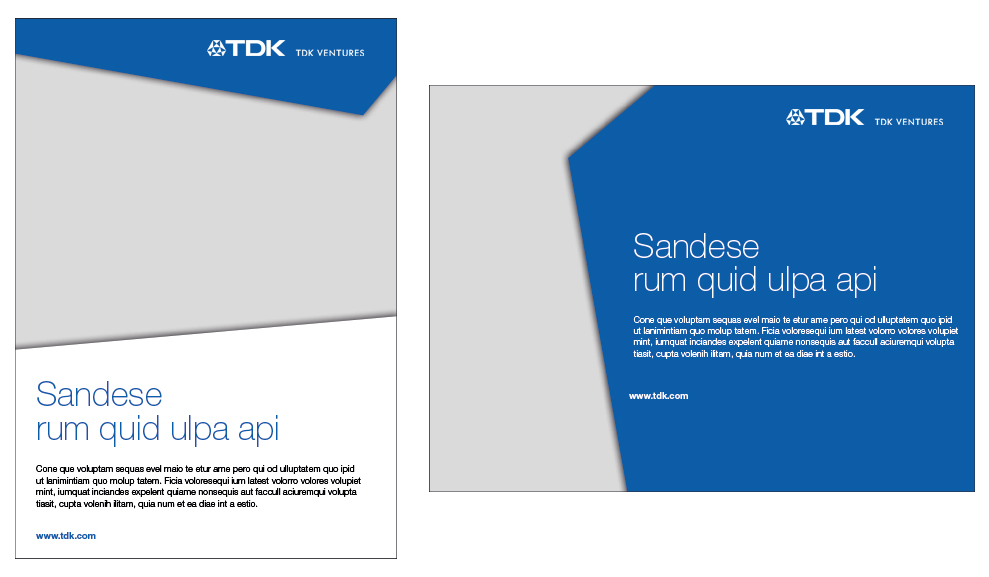
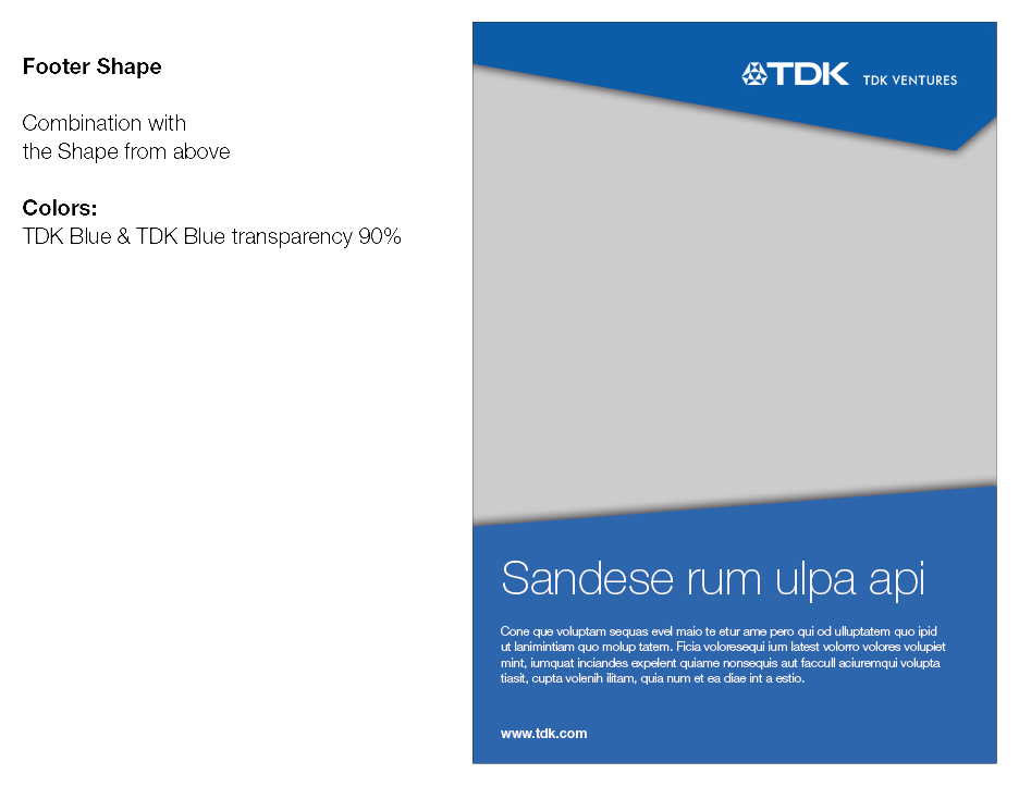
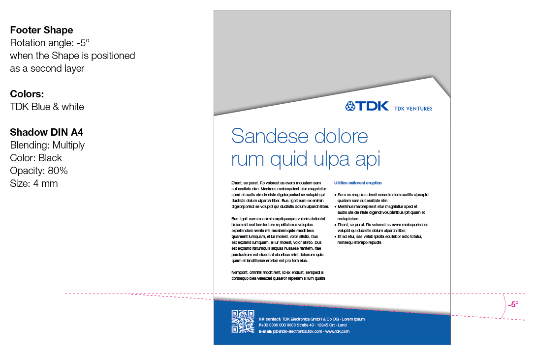
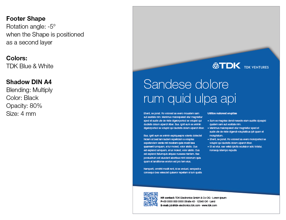
Footer Shape
In general the shape layout could be combined with a secondary element called footer shape.
- Always placed at the bottom of a layout
- Colors are white or TDK Blue
- Must not be bigger then 1/3 part of the whole layout
Examples
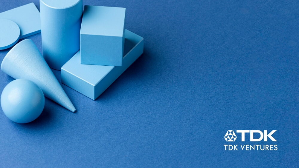
Visual Style
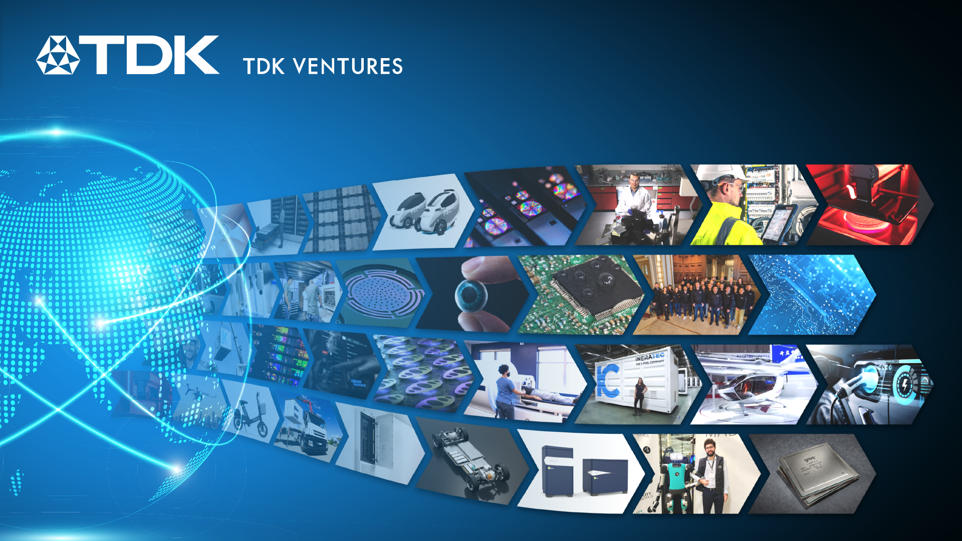
The TDK Ventures’ visual approach consists of five levels. It is a combination of “real-life” photos on the first two levels, as well as a more technical illustration on levels three and four. Level five represents the icon concept.
Overall the visual concept is to enable a warm, positive atmosphere. Using a wide range of international pictures to establish a highly credible, global appeal.
- Natural, warm, true to life, credible
- Easy, positive, light-hearted, friendly
- Modern, but not fanciful
- Global, multicultural
The Shape Derived from the TDK Logomark
General
The TDK Ventures’ visual approach consists of five levels. It is a combination of “real-life” photos on the first two levels, as well as a more technical illustration on levels three and four. Level five represents the icon concept.
Overall the visual concept is to enable a warm, positive atmosphere. Using a wide range of international pictures to establish a highly credible, global appeal.
- Natural, warm, true to life, credible
- Easy, positive, light-hearted, friendly
- Modern, but not fanciful
- Global, multicultural
The Shape Derived from the TDK Logomark
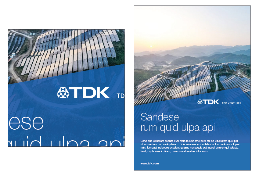
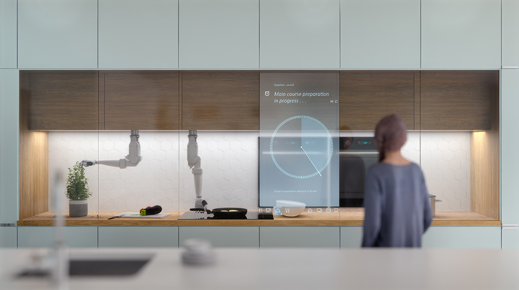
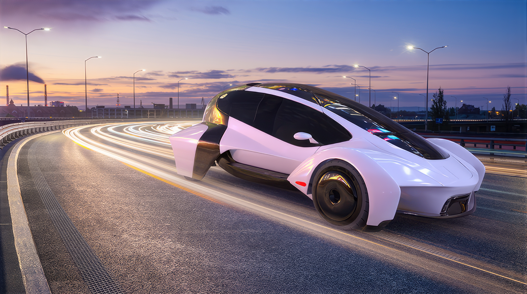
Application
In application pictures, the focus should be on TDK Ventures’ key markets and solutions for shown applications (e.g. solar energy, electric vehicles, smart phone, etc.). The style should snapshot authentic situations using natural lighting with a warm color mood.
Applications should not look like exhibition objects, but modern, credible, true to life and as if part of a natural environment.
Examples


Icons
Application and product icons serve as quick and simple orientation points:
- Highlight categories, products and solutions
- Indicate what type of industry a portfolio company is
- Could define a category
TDK Blue

Inverted

Gradient

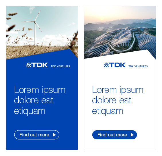
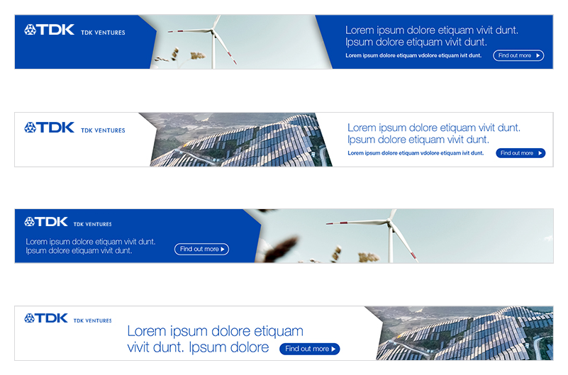
Digital Advertising
Individual animated or non animated banners can be created for external promotions and online adverts. The flexible shape layout elements are suitable for online banners. They enable consistent layouts, even in the smallest space.
But please note:
- Less is more: do not put too much information into one banner
- The shape is mandatory and to be used in TDK Blue or white
- Text must be placed as communication message
- Defined CTAs to be used
Examples
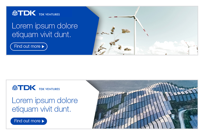
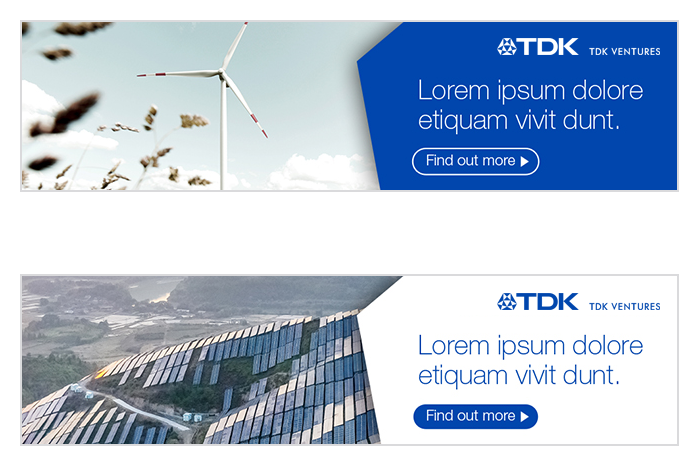
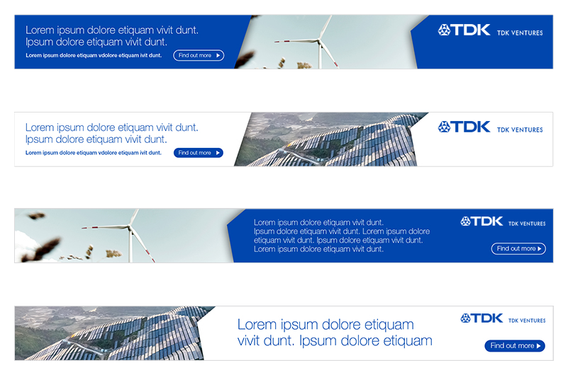
External Website Banners
Individual animated or non animated banners can be created for external promotions and online adverts. The flexible shape layout elements are suitable for online banners. They enable consistent layouts, even in the smallest space.
But please note:
- Less is more: do not put too much information into one banner
- The shape is mandatory and to be used in TDK Blue or white
- Text must be placed as communication message
- Defined CTAs to be used
Examples
LinkedIn Content
TDK Ventures’ posts on LinkedIn should be professional, insightful, and tailored to the platform’s audience of business professionals, job seekers, and industry leaders. High quality articles, updates or posts should highlight TDK Ventures’ expertise, industry trends and thought leadership. This can include blog posts, white papers, interviews, events or case studies that provide value to our network.
Team member achievements, company milestones, and behind-the-scenes insights into the workplace culture can also foster engagement and showcase authenticity. Leveraging LinkedIn for educational content, such as tips, tutorials, or webinars, positions TDK Ventures as a resource and authority within our field. Engaging with our audience through polls, questions, or shared success stories encourages interaction and builds our professional community. Always ensure TDK Ventures’ content posted to LinkedIn follows brand guidelines and uses the correct image specifications.
LinkedIn Profile Image
The TDK Ventures profile image should be simple and easily readable down to very small sizes. We recommend using a centered stacked logo with sufficient padding, with minimal design elements.

LinkedIn Header
The header should be designed primarily to fit within a 1400x336 safe zone, using minimal text and graphical elements. Please keep in mind the profile image will cover a portion of the left side.

LinkedIn Header for Employees
Employee profiles may also utilize TDK Ventures’ branded imagery; they also have a profile image covering some of the lower left side.

LinkedIn Article Posting
LinkedIn articles can be posted with a wide variety of image aspect ratios and can include graphics, photos and video content. Imagery posted should have minimal text and focus on high quality photography or design elements.
Image resolution width should be at least 1500 px and video content should be short and punchy (10-60 seconds) and loop if possible.

Medium Content
Medium is an ideal platform for publishing thoughtful, well-crafted content that offers value to a broad audience. TDK Ventures uses Medium to create content that is engaging, insightful, and well-researched, whether it’s a fresh take on current events, an exploration of industry interests, or practical advice on career, lifestyle, and creativity.
Storytelling and authenticity are key; articles that resonate emotionally or intellectually with readers tend to perform best. Additionally, since Medium caters to a diverse readership, clarity, good structure, and a polished writing style are essential for making a strong impact.
Medium Header
The header image should have minimal text and reflect the outgoing personality of the company and its team members.

Medium Article Image
Articles posted to Medium should have photography included. Please use images which some portion can be cropped down to a height of 360px to ensure they also display correctly in the article list view.

Youtube Content
TDK Ventures posts engaging, visually appealing, and value-driven content to YouTube to connect with our target audience and build our brand presence. This can include behind-the-scenes content to humanize the brand, event recaps, industry panels and online or in-person interviews.
Educational content, such as webinars or industry insights, positions TDK Ventures as a thought leader, while interviews and case studies build trust and credibility. Consistency in posting, visuals which follow the brand guidelines and a focus on high-quality production are key to achieving success on YouTube.
YouTube Header
The YouTube header, which appears on the TDK Ventures’ channel, should be focused on graphics and photography. Please note, creating the safe zone for proper viewing on all devices requires a substantial amount of image padding.

Youtube Thumbnails
The YouTube thumbnails should be 1280x720 and be clearly legible when scaled down. The same thumbnail can also be applied to Wistia for posting on TDK Ventures' websites.

X (Formerly Twitter) Content
TDK Ventures posts content on X which establishes thought leadership, showcases portfolio companies, and engages with the entrepreneurial community. This includes sharing industry insights, startup trends, and commentary on market shifts to demonstrate expertise.
Highlighting success stories and milestones of portfolio companies fosters credibility and celebrates the entrepreneurial ecosystem. Engaging with founders by retweeting or replying to their updates helps build meaningful connections.
Additionally, sharing resources like blog posts, funding guides, or event announcements, positions TDK Ventures as a valuable partner to startups. Maintaining a mix of professional and conversational tone, while encouraging interaction through polls, questions, or thought-provoking statements, can amplify the TDK Ventures’ visibility and influence on the platform.
X Profile Image
The TDK Ventures’ profile image should be simple and easily readable down to very small sizes. We recommend using a centered stacked logo with sufficient padding and minimal design elements.

X Profile Banner
The X header appears when users go in to the TDK Ventures’ profile. It should have minimal text and represent TDK Ventures as a friendly, people-first organization. Please note, some of the image will be covered by the profile image in the lower, left-hand corner.

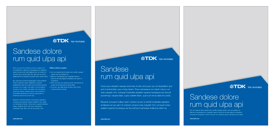
Print Media
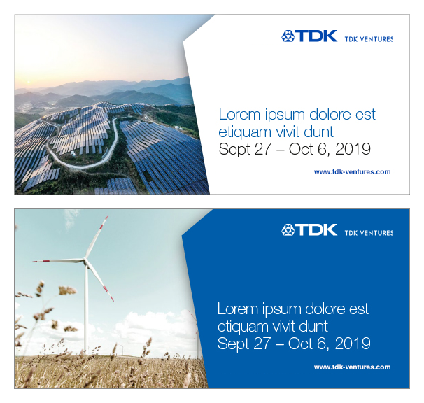
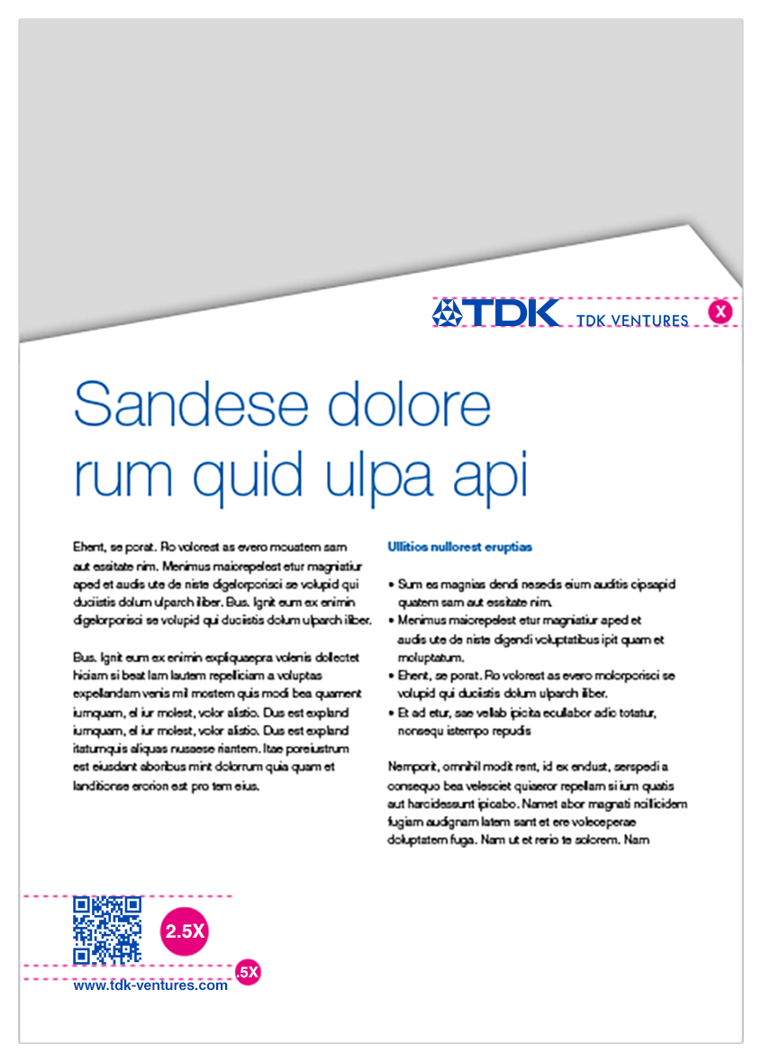
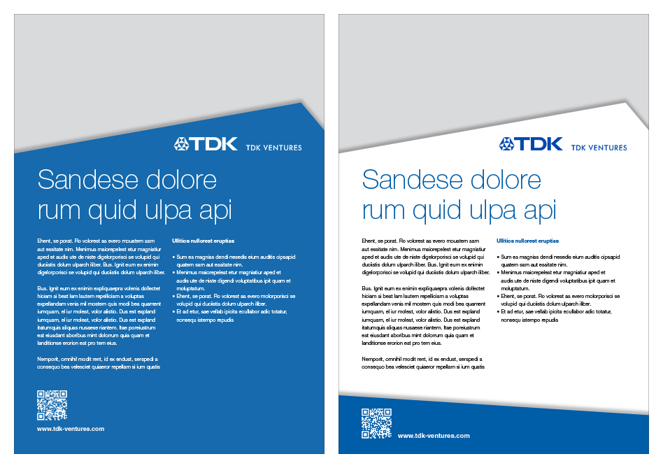
Advertising provides TDK Ventures the perfect stage for approachable communication, with highest flexibility by the shape layout.
The following definition should ensure a uniform look for TDK Ventures’ advertising.
- Recommendation: ads should measure at least 5.8 x 8.3 inches (A5) and are 1/1 or 1/2 page layout
- The shape is a bottom or top layout
- Could be combined with the footer shape
- Color is white or TDK blue
- The shape could be blue transparent
- Minimum size of white or blue shape: 1/4 page
- Minimum size of visual area: 1/4 page
- Headline and subline must never be placed on the picture
- A maximum of up to 4 pictures could be used in the layout.
Examples
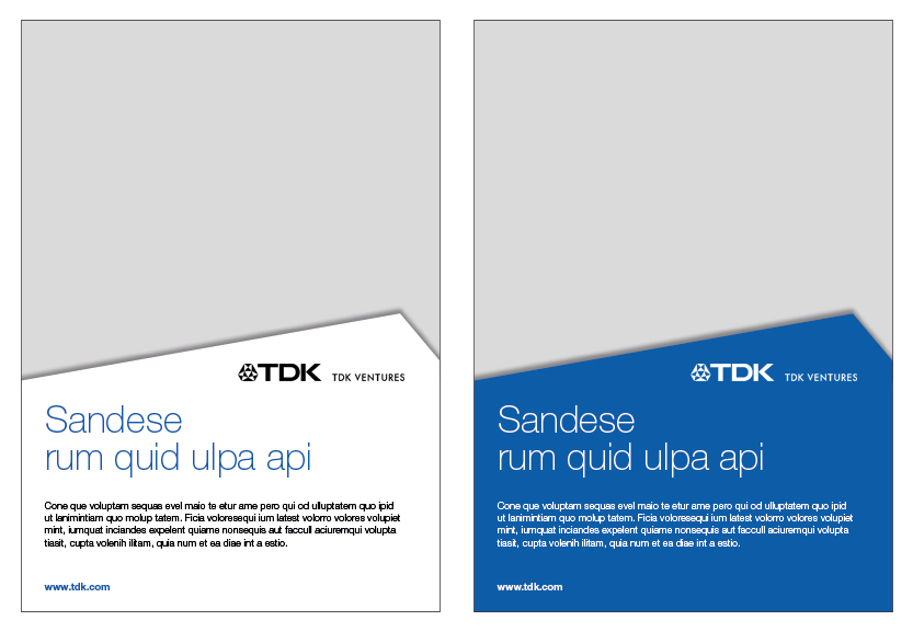
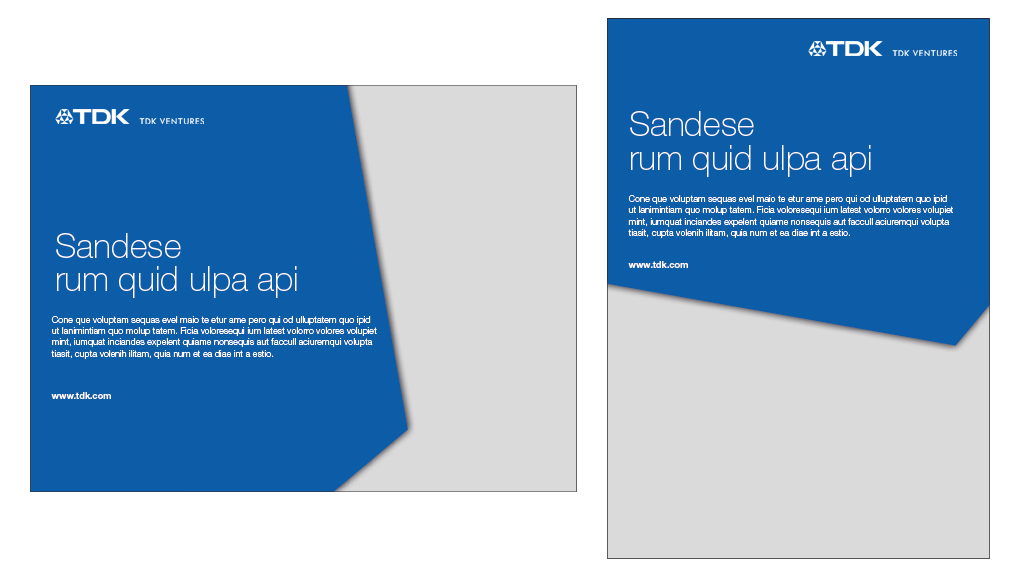
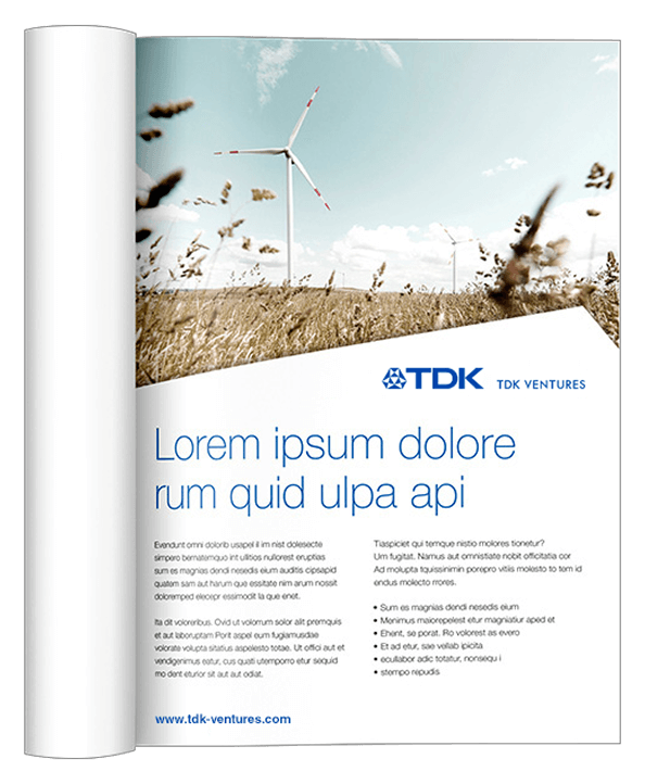
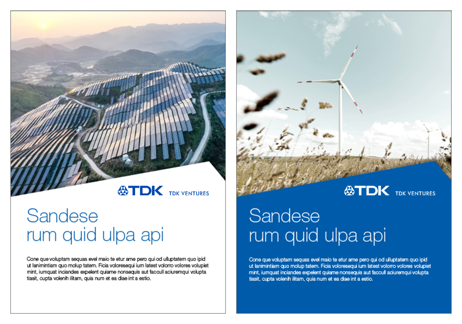
Print Advertising
Advertising provides TDK Ventures the perfect stage for approachable communication, with highest flexibility by the shape layout.
The following definition should ensure a uniform look for TDK Ventures’ advertising.
- Recommendation: ads should measure at least 5.8 x 8.3 inches (A5) and are 1/1 or 1/2 page layout
- The shape is a bottom or top layout
- Could be combined with the footer shape
- Color is white or TDK blue
- The shape could be blue transparent
- Minimum size of white or blue shape: 1/4 page
- Minimum size of visual area: 1/4 page
- Headline and subline must never be placed on the picture
- A maximum of up to 4 pictures could be used in the layout.
Examples
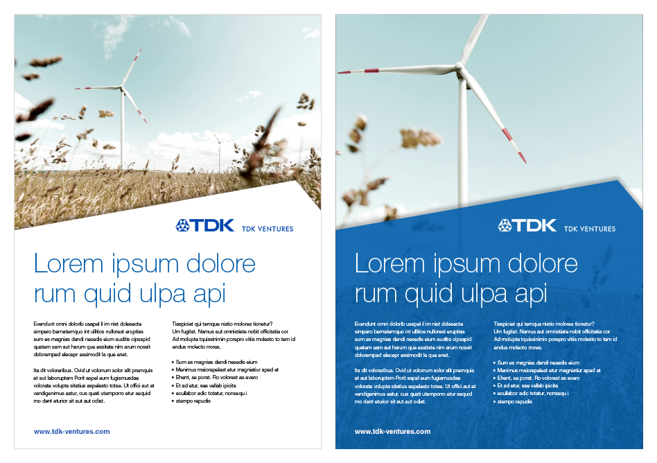
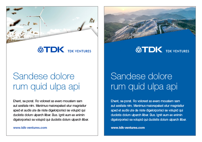
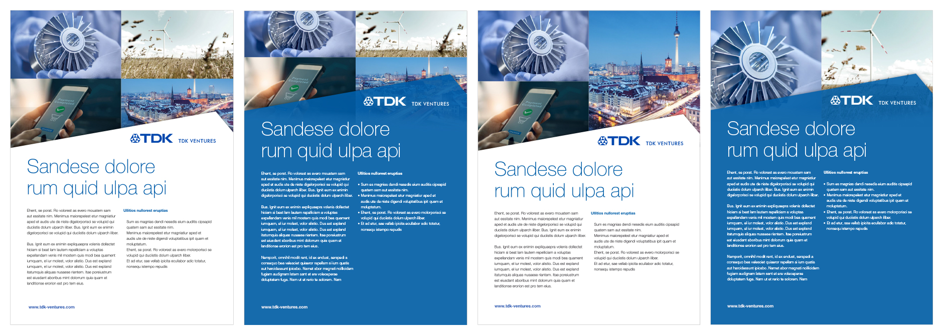
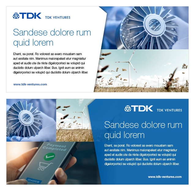
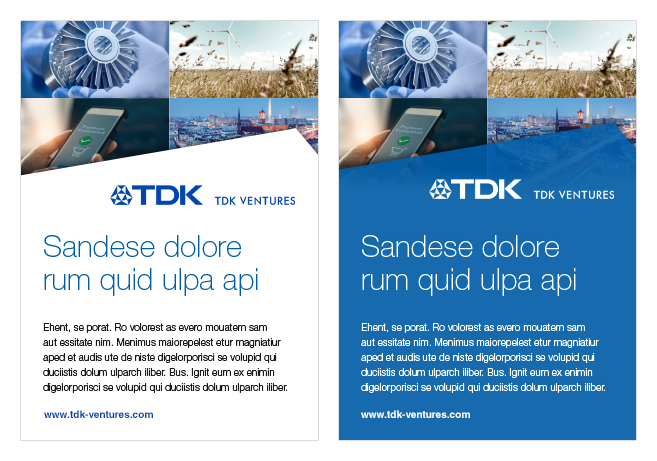
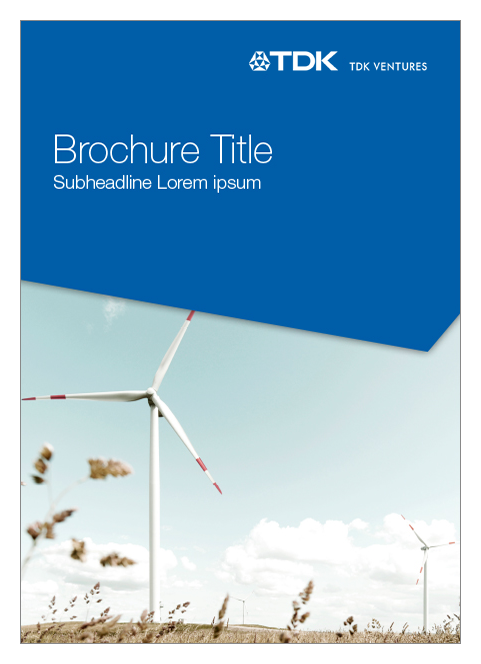
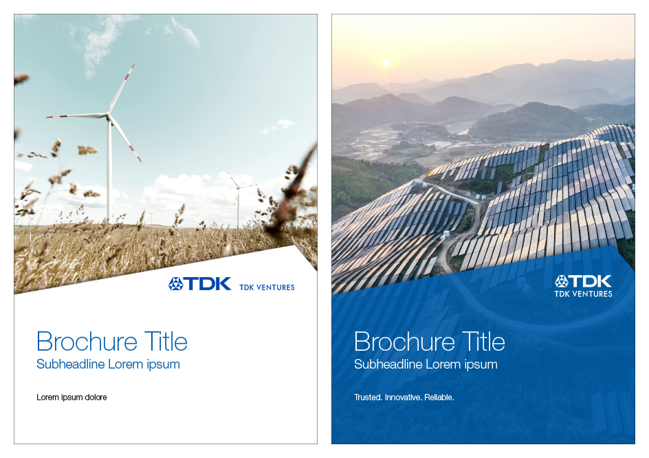
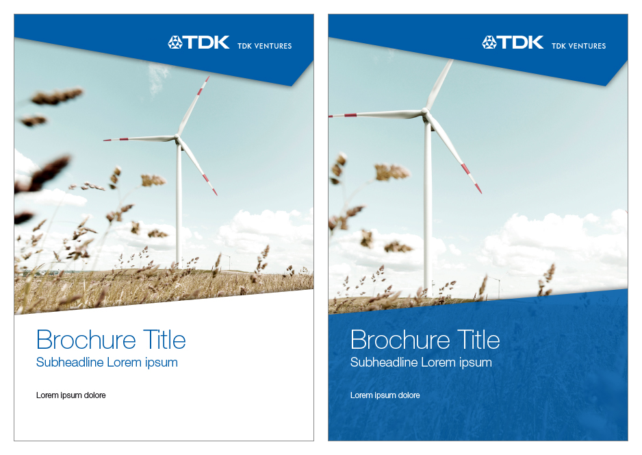
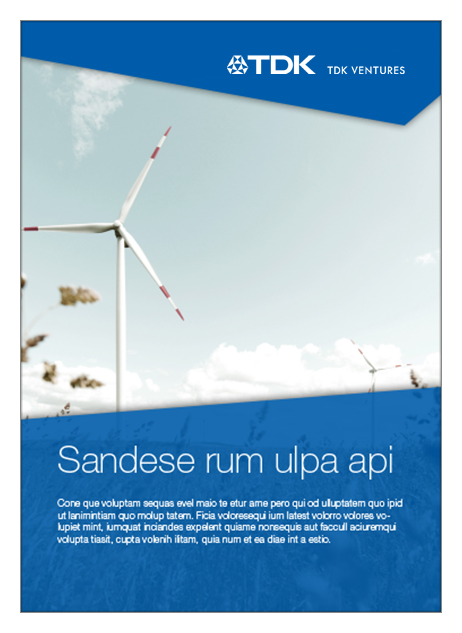
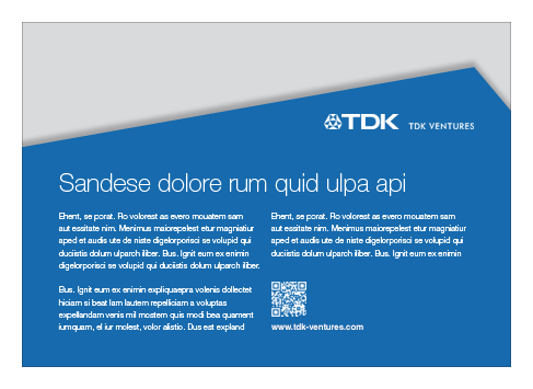
Brochures
The TDK Ventures’ basic guideline for brochures.
- The shape can be at the top or bottom of the layout and must be white or TDK Blue
- Alternatively the shape could be blue transparent
- For brochures the position and size of shape and headline are fixed and cannot be modified
- Headlines should not exceed three print lines including the sub-headline
- Headline and sub-line must never be placed on the picture
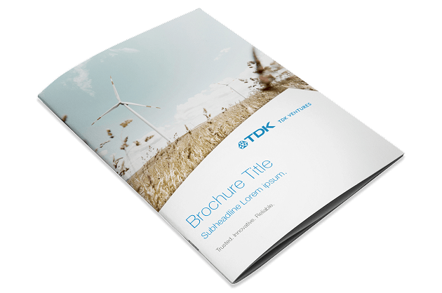
Examples
Posters
Using the correct TDK Ventures brand identity in print posters is crucial for creating a strong, cohesive brand image that resonates with audiences and attendees. Consistent use of brand colors, fonts, logos, and imagery ensures that the poster aligns with the brand’s overall look and feel, making it instantly recognizable and memorable.
A well-aligned visual identity in print materials enhances brand recall, drives engagement, and differentiates the brand from competitors in the physical environment.
Examples
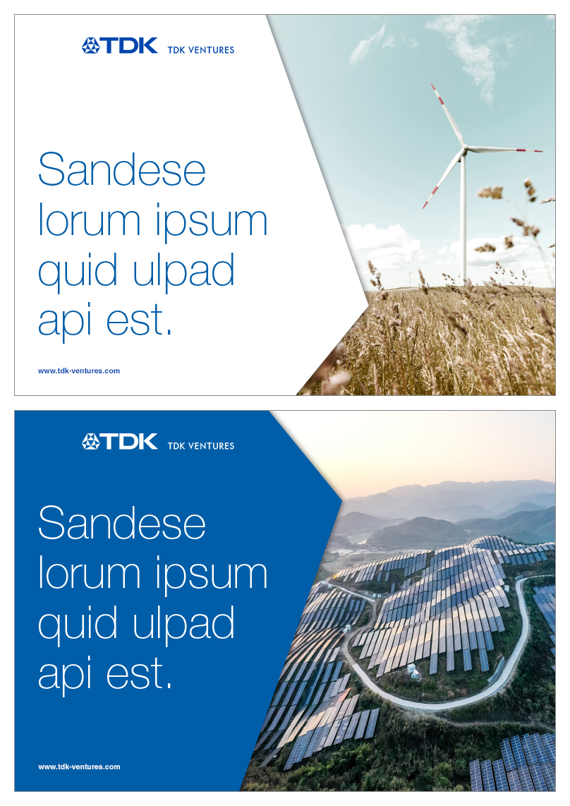
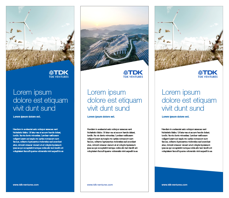
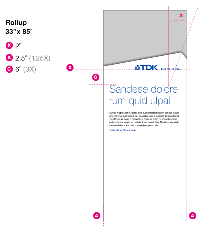
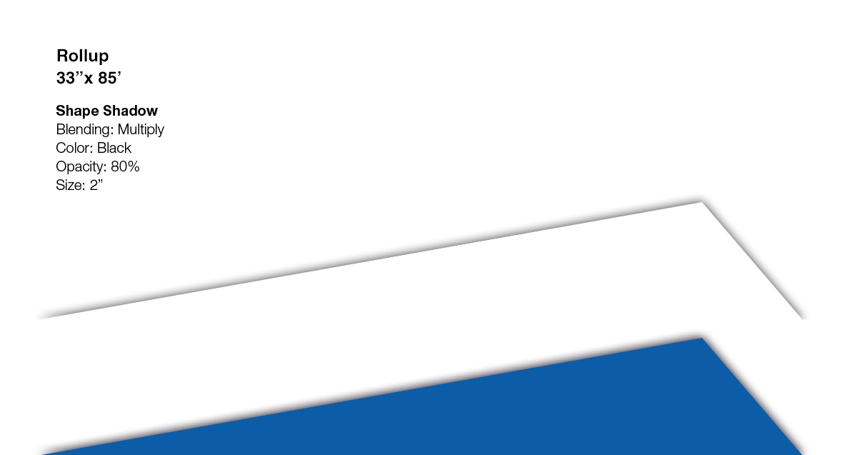
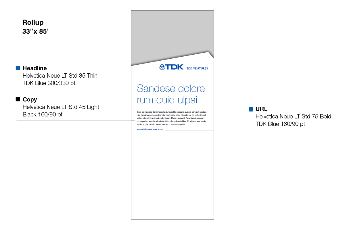
Roll-ups
Roll-ups are a highly flexible communication tool, due to its format and quick set-up.
The TDK shape layout of roll-ups may vary from very eye-catching with large visuals to a more informative style with text.
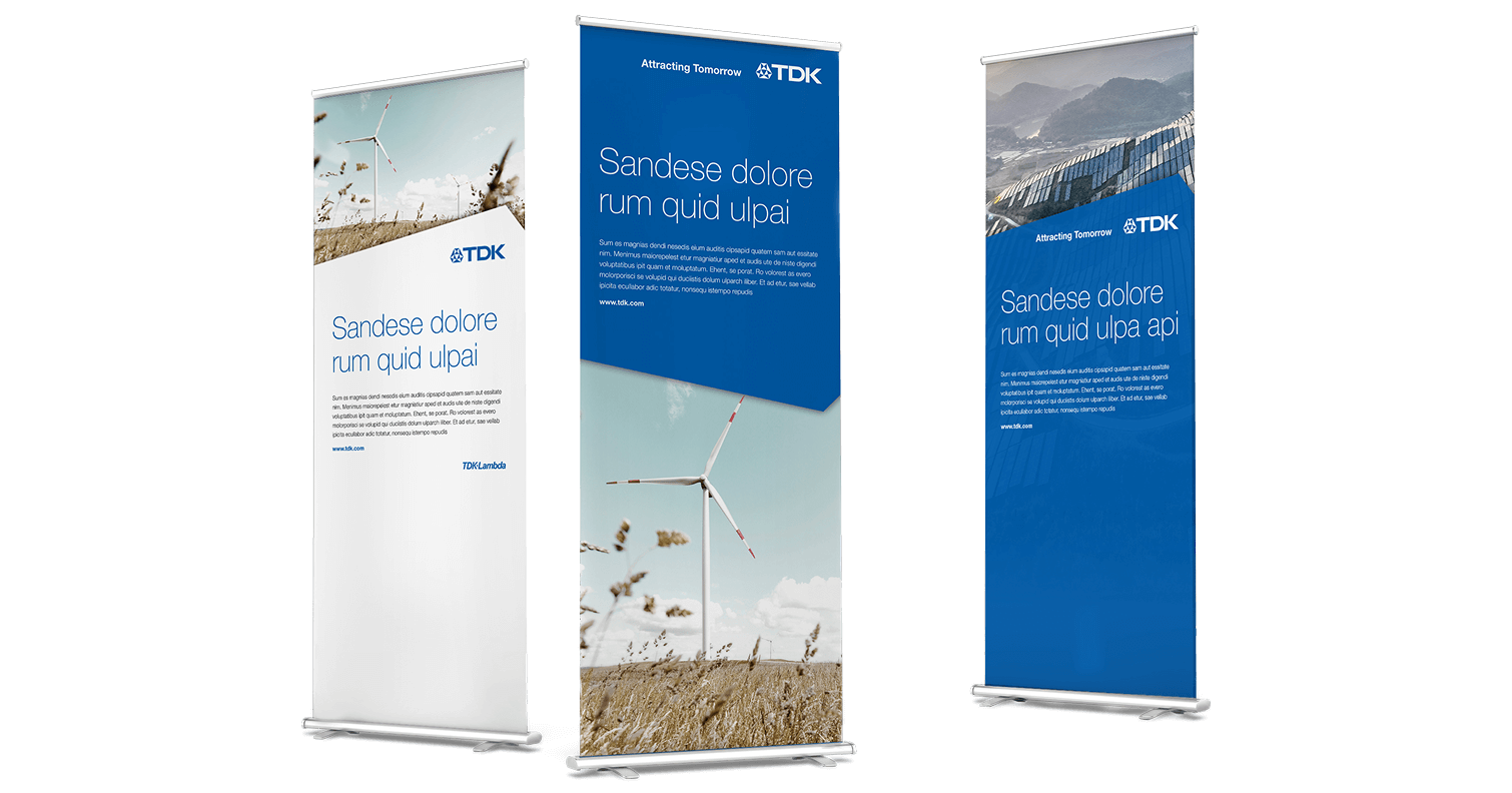
Examples
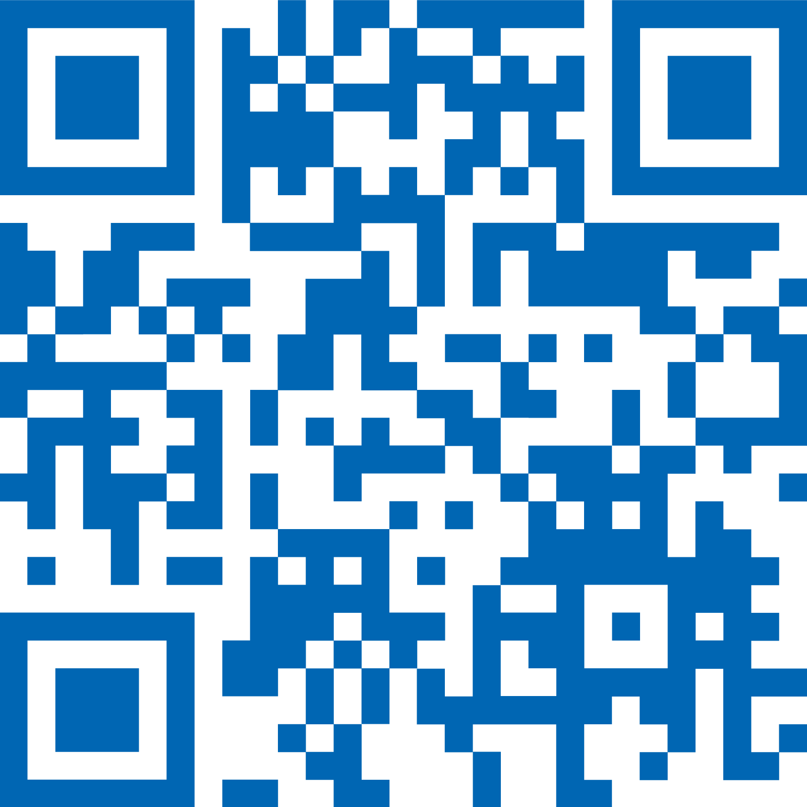
QR Codes
A QR code could be used in print or online media to deliver more content via a link to a web page or application.
To generate a QR code please have in mind:
- It must be sufficiently complex to ensure it is correctly identified by the scanner
- The contrast must be high
- A code should not be too small
- Color should be black, TDK Blue or white
Examples
Video & Motion
This guideline defines the basic visual elements and format requirements for video content.
In general, the TDK Ventures design guidelines apply to all films, videos, and animations.
They should reflect TDK Ventures’ general look and feel, as defined in the basic elements of this guideline.

General
This guideline defines the basic visual elements and format requirements for video content.
In general, the TDK Ventures design guidelines apply to all films, videos, and animations.
They should reflect TDK Ventures’ general look and feel, as defined in the basic elements of this guideline.
Video Intro & Outro
It is essential to use on-brand intro and outro in all videos to maintain a cohesive and recognizable brand identity. Using the provided videos (in the resources hub) will help reinforce our brand’s image and make the content immediately identifiable, helping to build familiarity and trust with audiences.
Start Screen/Intro
The start screen displays the TDK Ventures’ logo. But the logo must not be animated in any way. Optionally, it can be followed by the film title. A short, catchy title must be defined for each film.
For social media only, the start screen into is not necessary.
Closer/Outro
The film closer starts with a white fade-in followed by the claim. The claim fades out and is replaced by the TDK Ventures’ logo followed by the URL. At the end of the film, the closer should remain on screen.
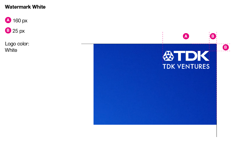
Watermark
For the video watermark the logo is placed in the top right corner in a defined size and position. The logo should be white or TDK Blue depending on the background being light or dark.
If the film or animation has an intro and outro, the use of the watermark is not mandatory.
Examples
Typography
- Helvetica Neue LT Std
- Font color could be TDK Blue, white or black
- Do not use shadows or outlines
- Left aligned or centered if appropriate
- Picture background must be quiet for a good readability
Examples


Lower Third
The lower third shows information like name, title and company name of the shown person.
The fade-in should appear as follows: In the first second, animate the background to move from left into position.
At the end, fade out both the background and the text. Do not use the TDK Ventures’ logo within lower-third fade-ins/outs.
Examples

Motion Transitions
Using on-brand elements in TKD Ventures’ videos ensures consistency, reinforces brand identity, and enhances the overall impact of your content. Well-designed transitions using on-brand elements create a polished, cohesive look that reflects professionalism and attention to detail. TDK Ventures’ branded transitions also tie into other marketing materials, such as websites, social media, and print, creating a seamless brand experience across platforms.
The shape should be used in a horizontal motion to create transitions like the examples below.
Examples
Subtitles
- Subtitles are suitable in the following scenarios:
- A film is not available in a specific language and an audio version is not an option
- Audio cannot be used in a certain location (i.e. at public exhibitions)
- Before adding subtitles to a film, please make sure that it matches the specifications and is 1920×1080 pixels resolution (16:9).
- Subtitles are used different than voice overs, they do not necessarily have to have the exact same timing of appearance.
Examples


Websites
The TDK Ventures’ website is a vital platform for communicating brand and visual identity, because it serves as the brand’s primary digital presence and the presumed first point of contact. By employing the TDK Ventures’ design elements like colors, typography, images, and layout, the website reflects the brand’s personality, values, and tone, creating a memorable and consistent user experience.
Beyond visual elements, the website’s content, navigation style, and interactive features all contribute to conveying the brand’s message and purpose. The TDK Ventures’ website should help to build trust, enhance credibility, and encourage engagement, allowing users to connect with the brand on a deeper level. Continuing a strong brand identity on the website makes the brand stand out in a competitive digital landscape.
Examples
General
The TDK Ventures’ website is a vital platform for communicating brand and visual identity, because it serves as the brand’s primary digital presence and the presumed first point of contact. By employing the TDK Ventures’ design elements like colors, typography, images, and layout, the website reflects the brand’s personality, values, and tone, creating a memorable and consistent user experience.
Beyond visual elements, the website’s content, navigation style, and interactive features all contribute to conveying the brand’s message and purpose. The TDK Ventures’ website should help to build trust, enhance credibility, and encourage engagement, allowing users to connect with the brand on a deeper level. Continuing a strong brand identity on the website makes the brand stand out in a competitive digital landscape.
Examples
Icons
Application and product icons serve as quick and simple orientation points:
- Highlight categories, products and solutions
- Indicate what type of industry a portfolio company is
- Could define a category
TDK Blue
Inverted
Gradient
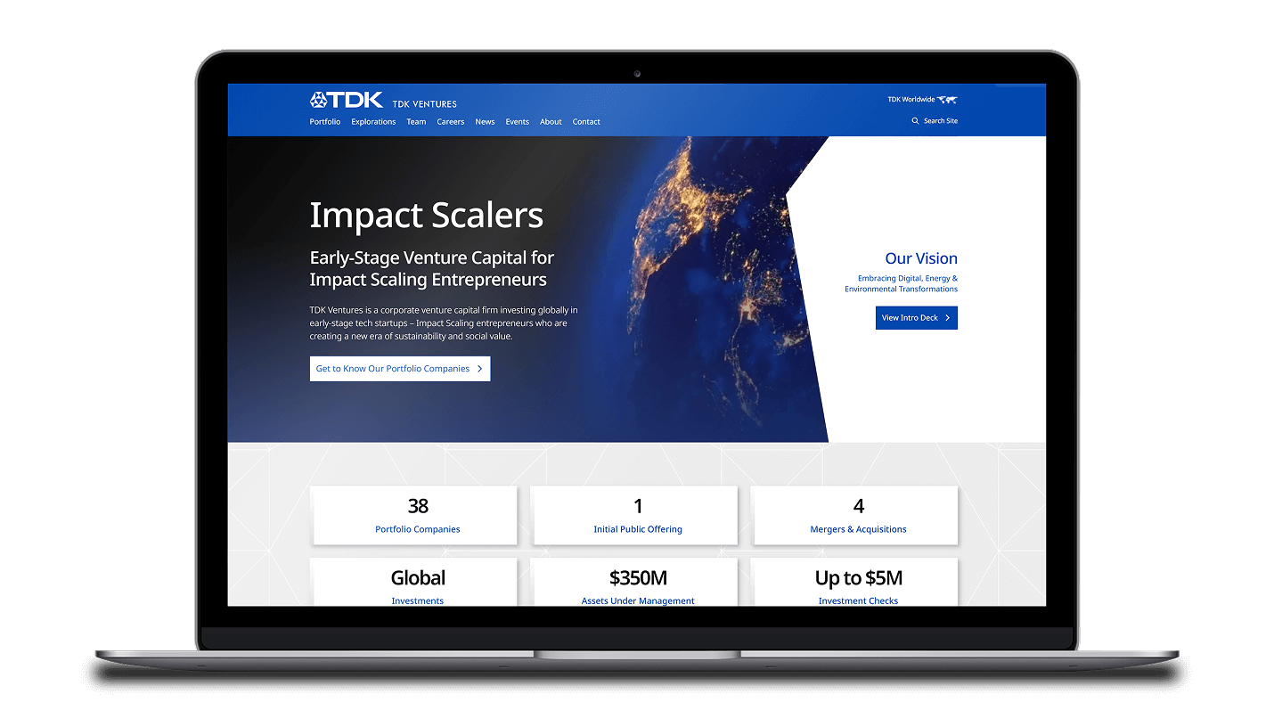
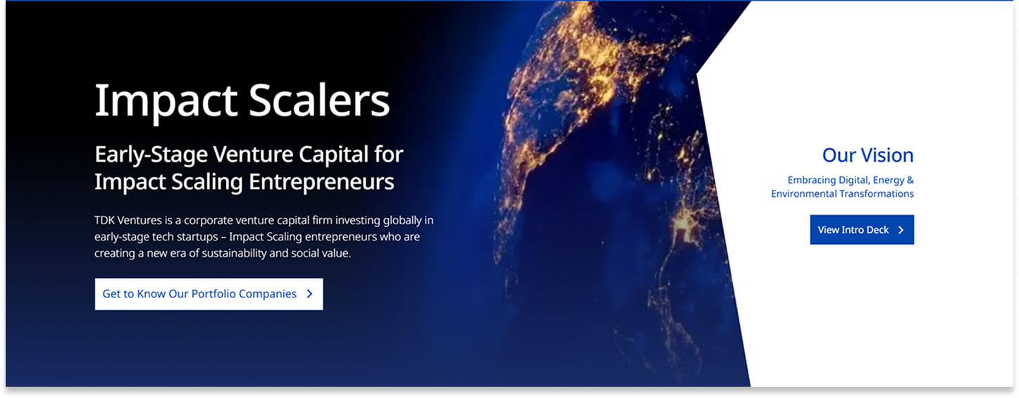
Hero Images
The hero image can utilize the shape on either the left or right as well as contain text and call to action buttons. Images used in the hero section should meet the visual requirements for TDK Ventures’ photography and allow any overlaying text to be clearly visible.
2024 Homepage Hero Image with Text Overlay
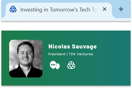
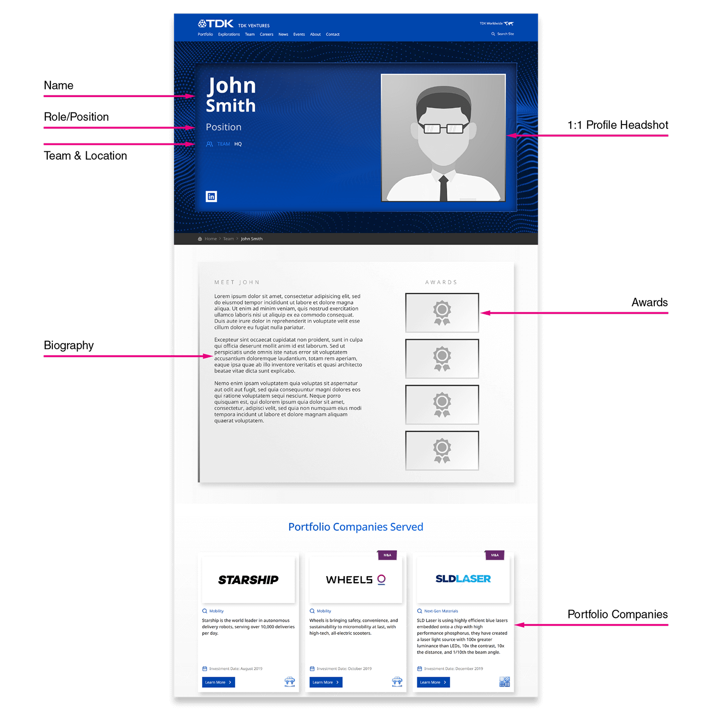
Team Member Portraits
TDK Ventures always presents team members through professional photography on an approved background as it adds an authentic touch to the brand while conveying professionalism and credibility.
High-quality images of team members help humanize the brand, allowing customers to feel more connected and build trust, as they can see the real people behind the business. These photos reflect the company’s commitment to quality, fostering a positive impression and enhancing the brand’s reputation. Additionally, it reinforces the culture and values of the organization, making it more relatable and appealing to clients and potential hires alike.
Team Member Portraits

Biographies
Compelling employee biographies on the TDK Ventures website are important because they highlight the expertise, personalities, and values of the people behind the brand, making the business more relatable and trustworthy.
Well-crafted bios showcase the qualifications and unique skills of each team member, reinforcing the brand’s credibility and competence. They also offer insights into the company culture, helping potential clients and partners feel connected and confident in their choice to work with the team.
Former team members should have their bios rewritten to past tense for references to their roles and responsibilities at the time of their employ.

Examples
News Articles
News articles on the TDK Ventures’ website should follow established visual and tone guidelines to ensure brand consistency, professionalism, and clarity. Adhering to visual guidelines, such as font choice, layout, and color schemes, make articles visually cohesive with the rest of the website, enhancing the user experience and reinforcing our brand identity.
Likewise, using a consistent tone in language maintains the brand’s voice, helping readers feel connected and fostering trust. Following these guidelines across news articles creates a polished, unified impression, making the content more credible, memorable, and engaging for the audience.
Examples
Hub & Resources
This section serves as a central repository of files necessary for maintaining brand consistency.
Colors
Fonts
Logos
Raster
Adobe PDF
QR Codes
Raster
Site Icons
Scalable Vector Graphics
Video & Motion
Apple Quicktime 4444
MPEG-4 Part 14
Corporate Venturing Insider Brand and Style Guide
These guidelines are to ensure brand consistency across all Corporate Venturing Insider website and social posts.

Event Assets Brand and Visual Guide
These guidelines are to ensure brand consistency across all TDK Ventures’ events.
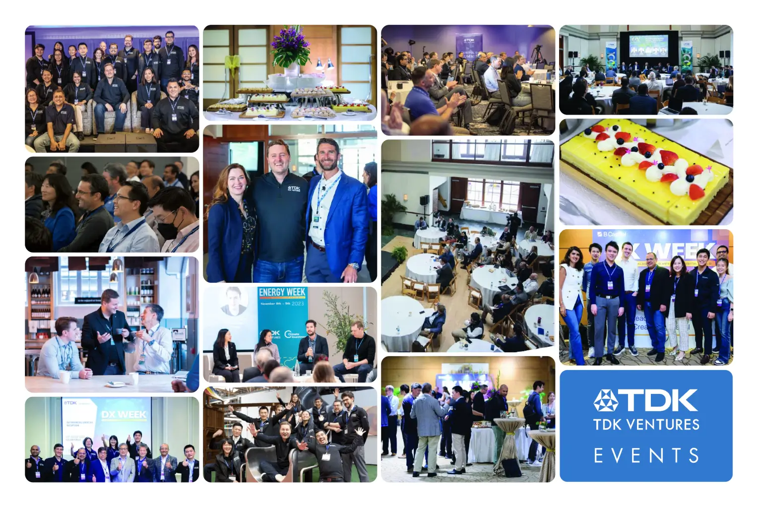 Events Style Guide
Social Media
TDK Ventures’ guidelines should be followed when posting on social media to maintain a consistent and professional identity that resonates with the audience. These guidelines ensure the tone, visuals, and messaging align with the company’s values and mission which creates a cohesive cross-platform user experience.
Adhering to established fonts, colors, logos, and messaging styles makes posts instantly identifiable as part of the TDK Ventures’ brand, fostering a sense of reliability. It also minimizes confusion among followers and enhances credibility, which ultimately contributes to stronger relationships with customers and stakeholders.
Please follow all brand guidelines when posting on social media and be sure to include the following when applicable: